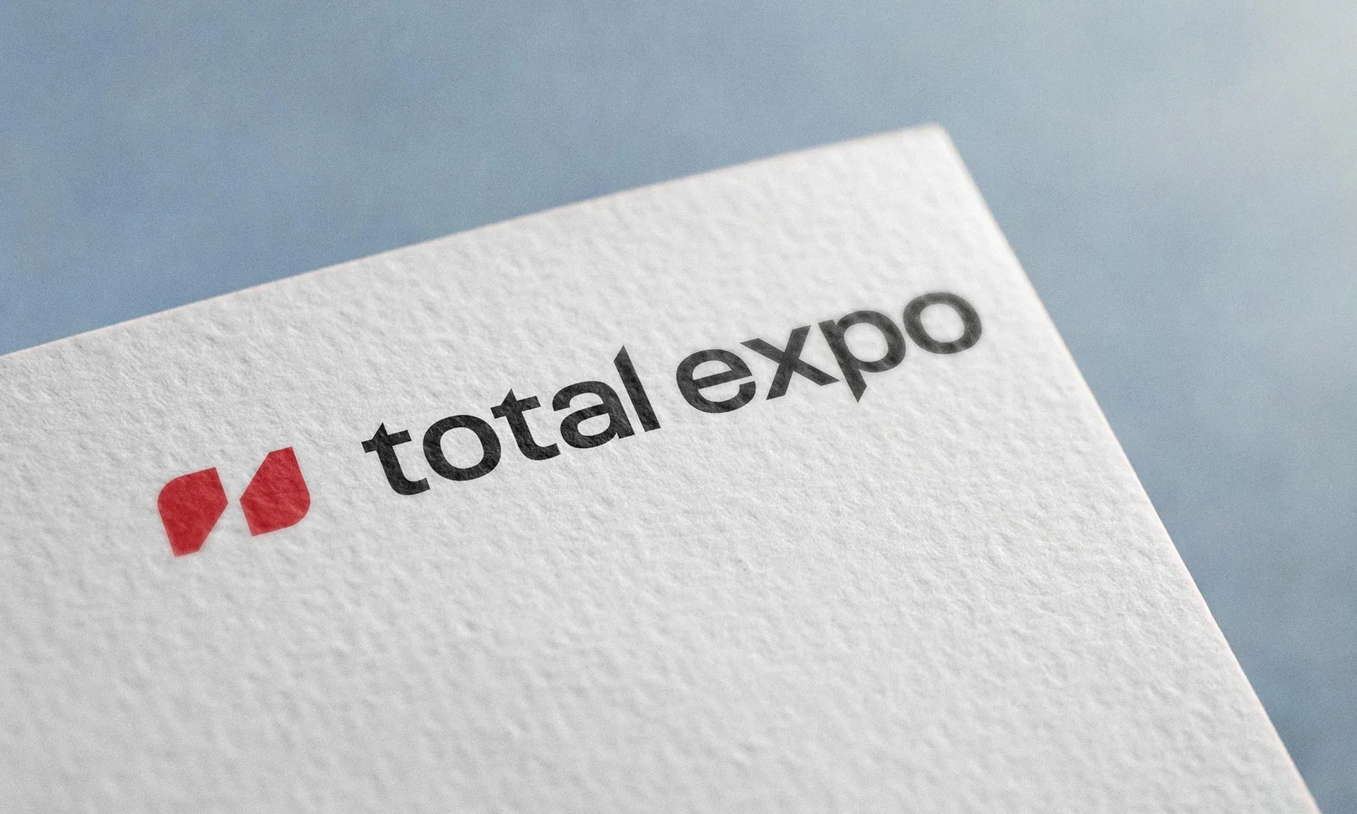
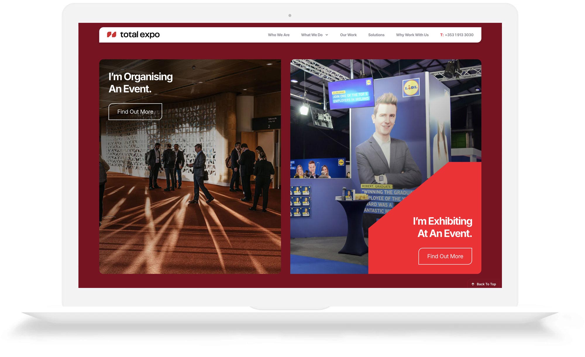
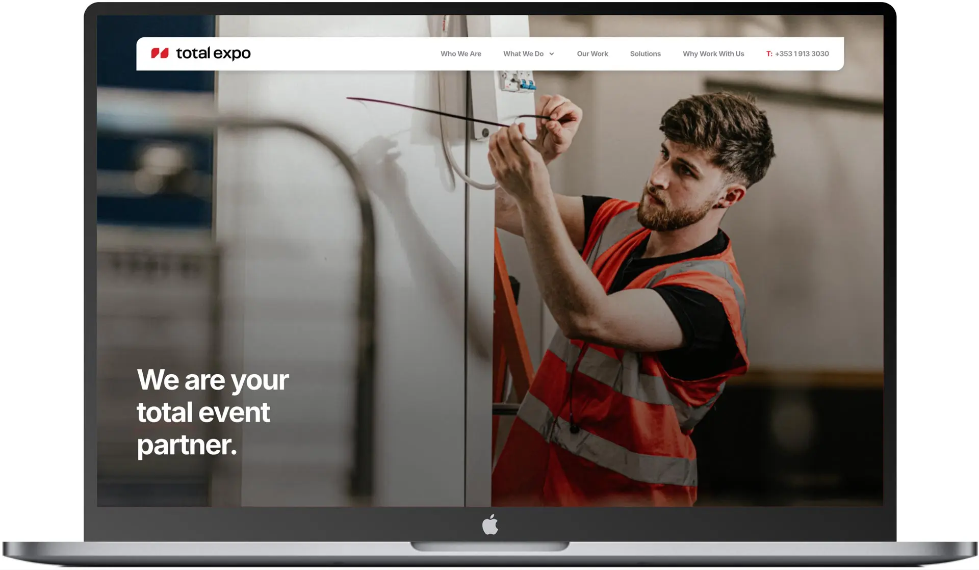
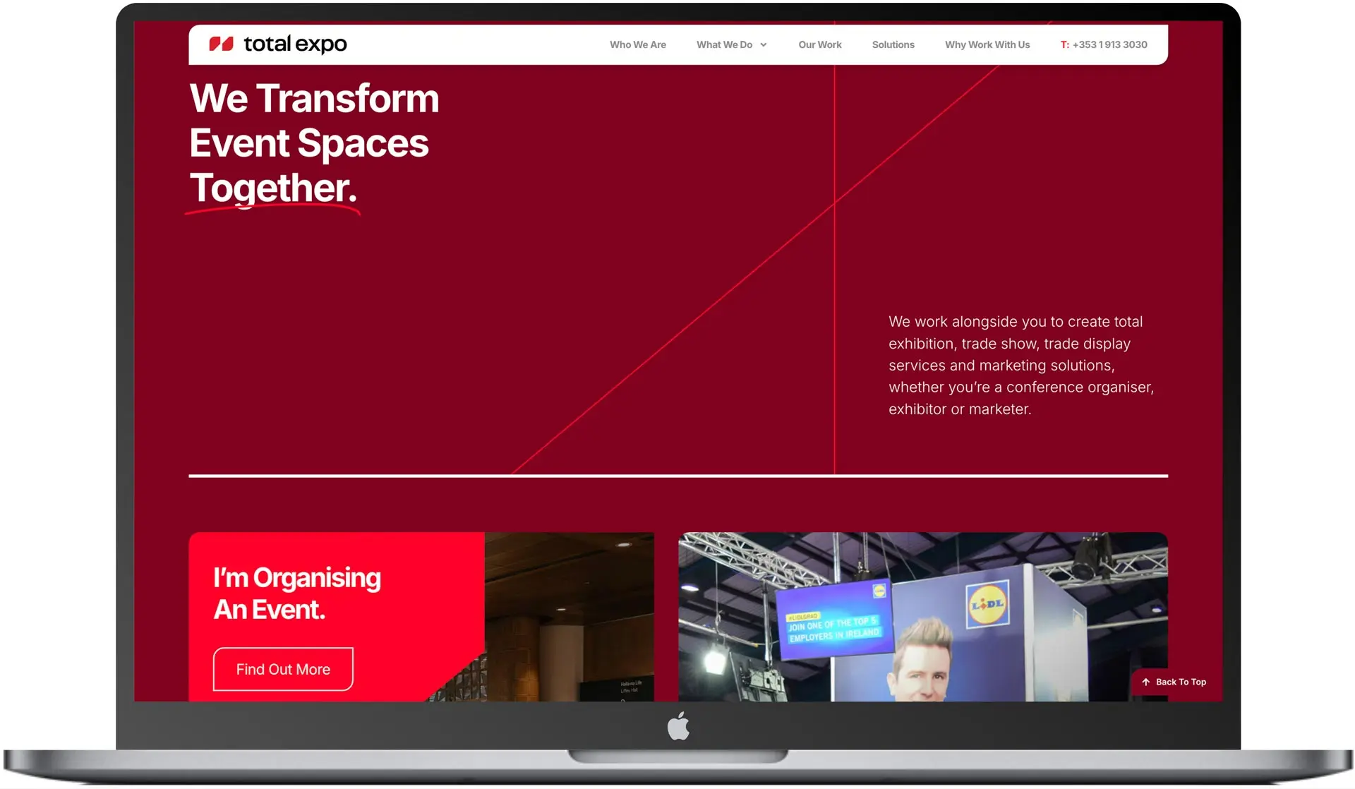
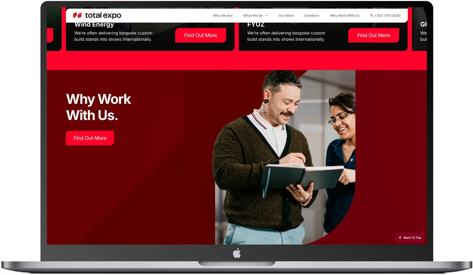
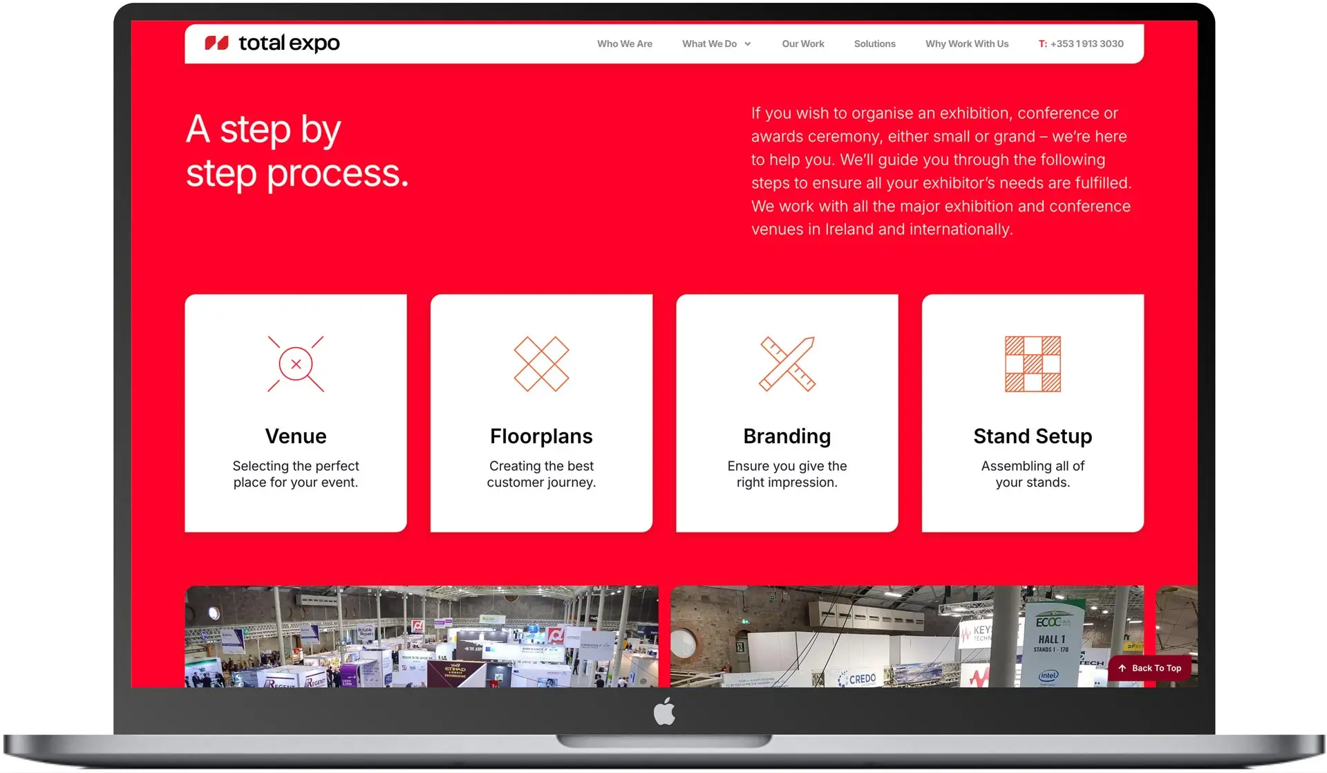
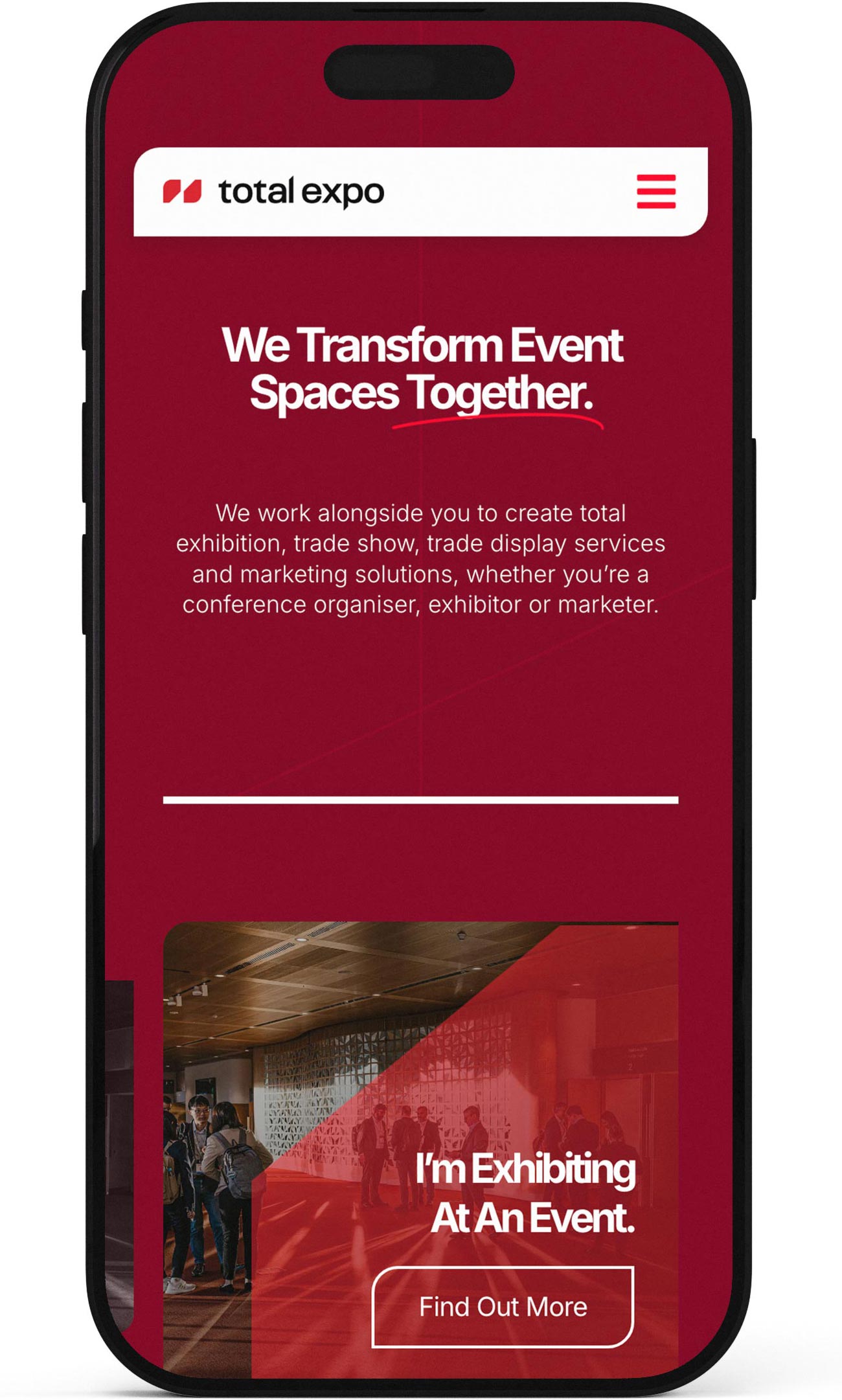
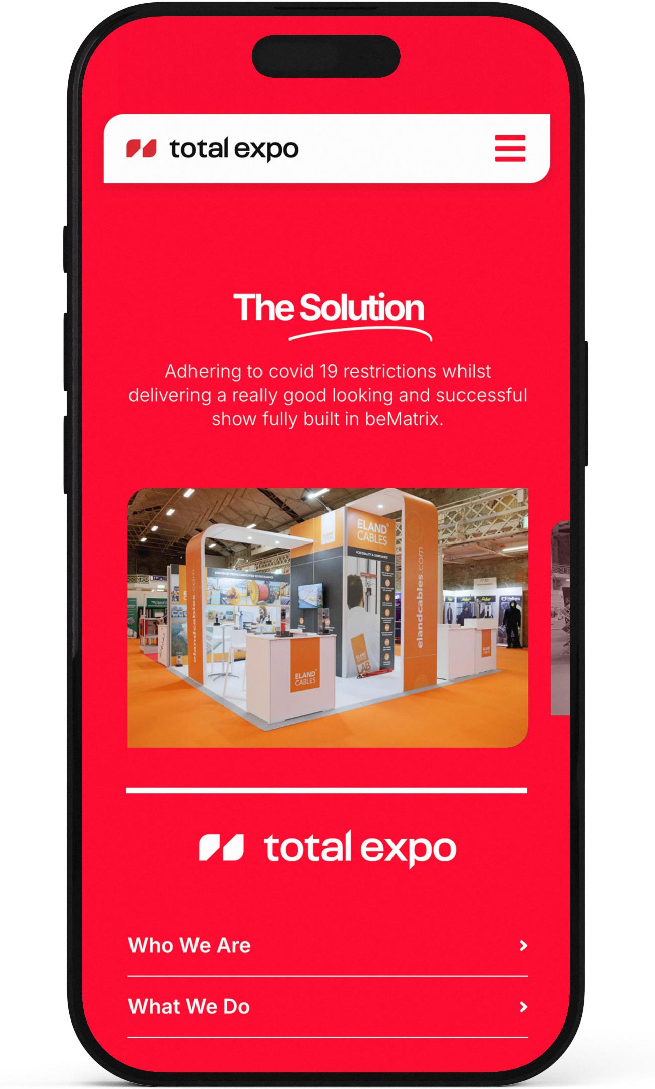
- Total_Expo
- Branding
A New Logo
Total Expo had used the same logo since their inception in 2009. I retained their primary colours (black, red and white. A new marque was created using a rigid 90 degree angle. This motif was employed to create consistency across Total Expo brand.
The logo is constructed from two simple shapes that form an “X” within the negative space. It represents the client and total expo working together.
Logo Design
Lorem ipsum dolor sit amet, consectetur adipiscing elit. Ut elit tellus, luctus nec ullamcorper mattis, pulvinar dapibus leo.
- Branding
Brand Guide
The Brand Guide for Total Expo was very extensive. In addition to detailing brand colours and typography, the document also included guidance on how to employ photography, graphic devices and applications such as vehicle graphics, workwear, stationery and pitch decks.
- Web design
Website with the WOW factor
The UK is a bigger marketplace than Ireland. Total Expo required a new, innovative website that would be image-rich, full of detail with lots of animations and points of interest.
- Step_01
Sketches
It all starts with putting pen to paper!
- Step_02
Figma Wireframes
The next stage is wireframing in Figma. The client was presented with first lo-fi wireframes, and then after approval, they were presented with high-fidelity wire frames. Following sign-off the full web build took place using WordPress.
- Step_03
Web build
A fully-responsive website was built using WordPress, Elementor Pro. I also made extensive use of Advanced Custom Fields to allow for greater levels of customisation that WordPress usually allows.
- Step_04
Mobile Responsive
A mobile-first approach is usually paramount with most websites these days. However, the bulk of Total Expo clients are actually accessing the website using desktop machines.